Rest Point Hotel
Brand Identity
Rest Point is a conceptual brand for a modern roadside hotel aimed at design-conscious travellers who value comfort, character, and a moment of pause on their journey. Rather than positioning the roadside stay as purely functional, the project set out to reframe it as an intentional, elevated experience.
Drawing on classic Americana, desert motels, and mid-century hospitality, the brief was to create a distinctive visual identity that felt warm, distinctive, and rooted in place, and that could extend meaningfully into the guest experience through in-room and on-site collateral.
-
Led the project end-to-end from concept to final execution.
Developed the name, brand positioning, and visual identity system.
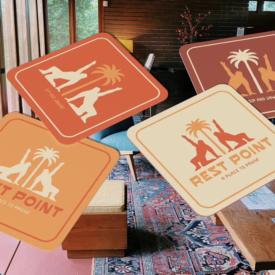
Designed the logo, colour palette, typography, and graphic language.
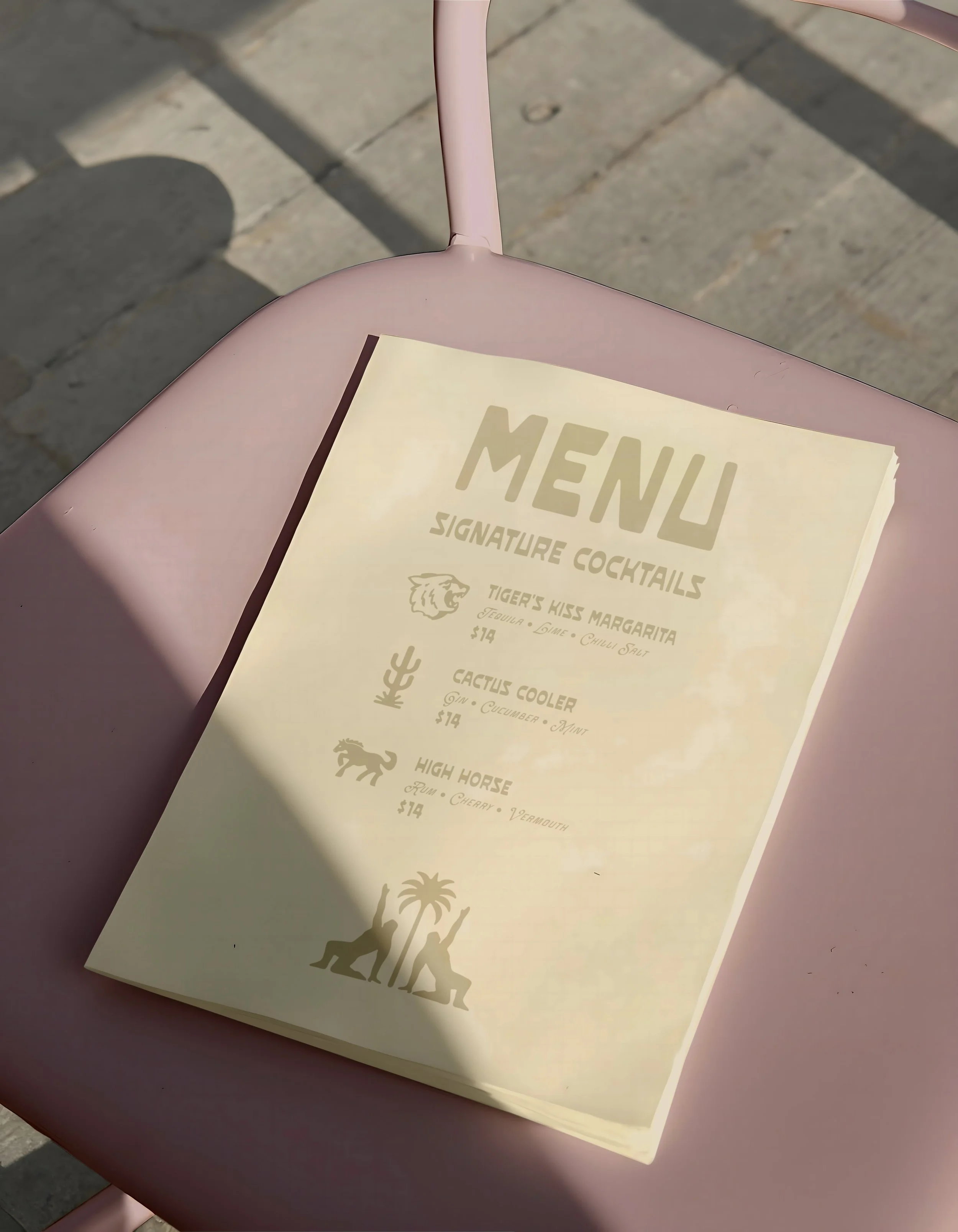
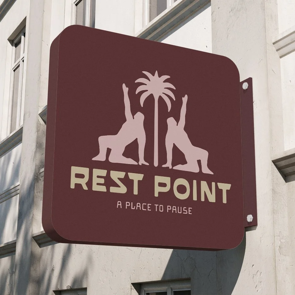
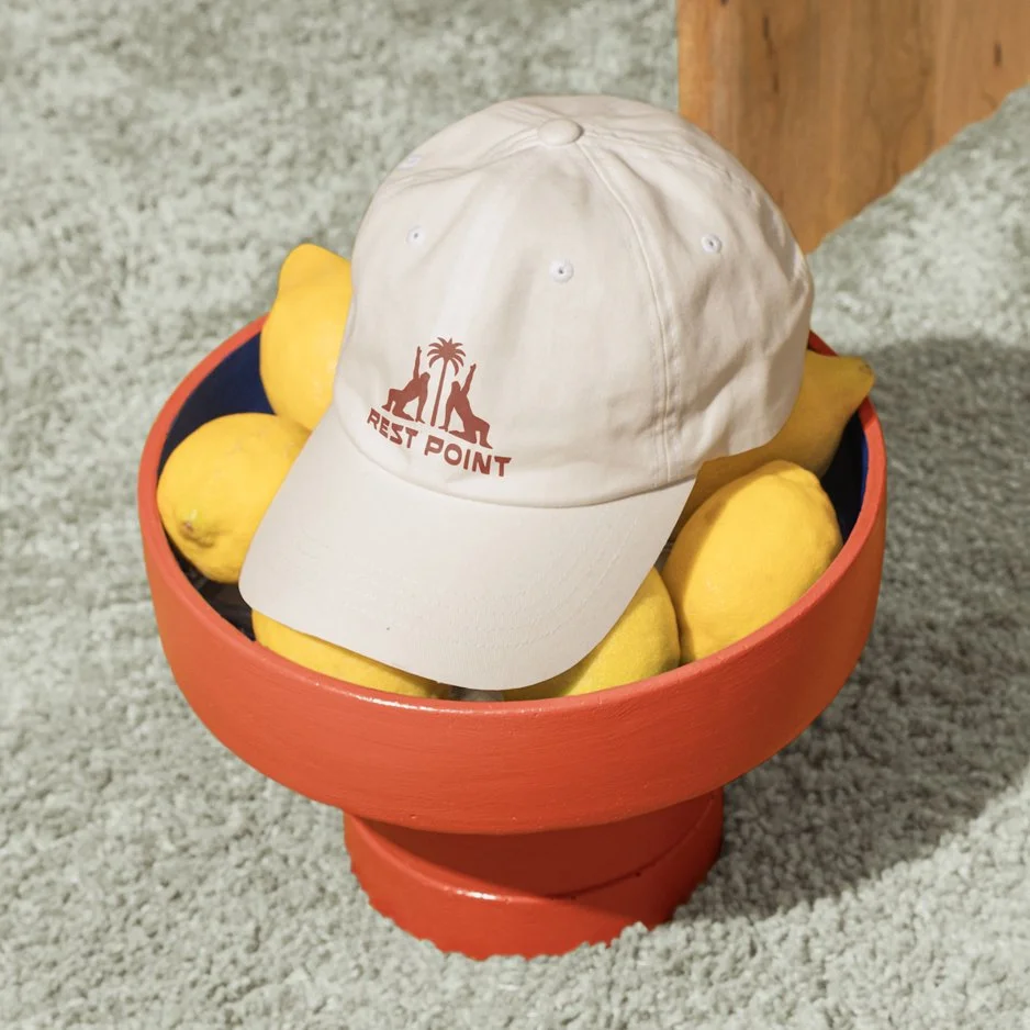
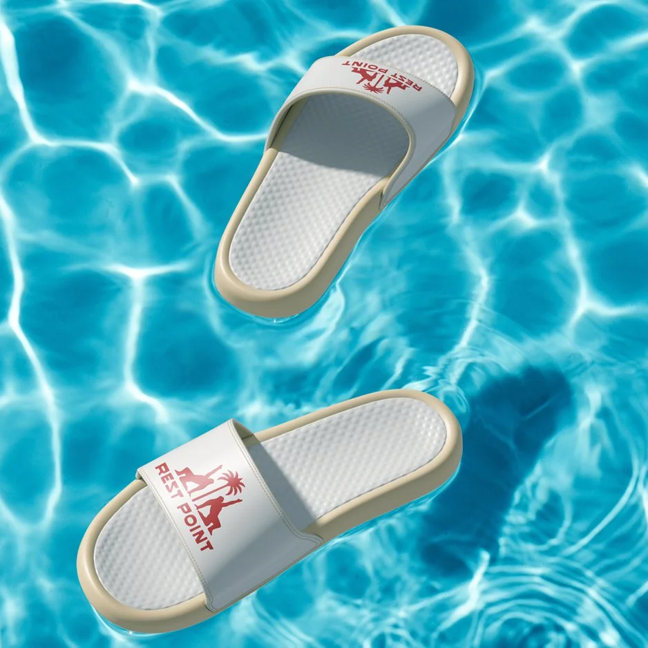
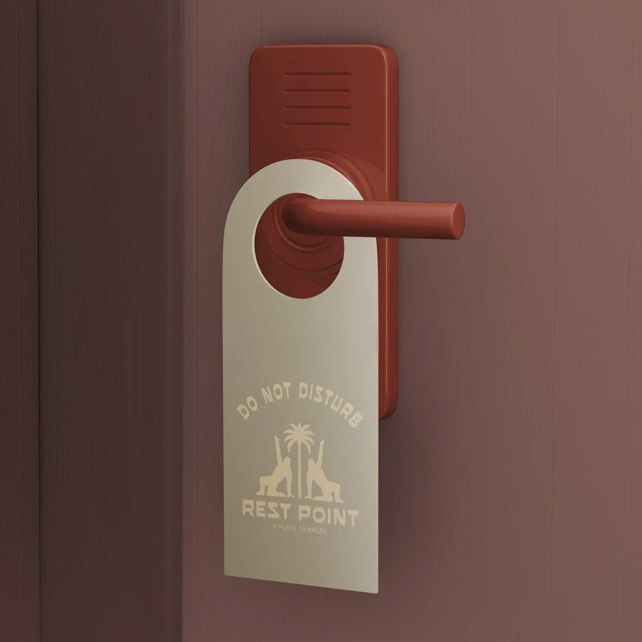
Created a suite of guest-facing touchpoints including menus, door hangers, merchandise, signage, and wayfinding elements.
-
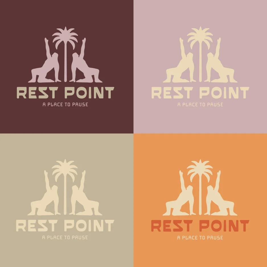
The identity balances retro charm with contemporary refinement. I developed a warm, sun-faded colour palette inspired by desert landscapes and mid-century interiors, paired with bold, friendly typography to create confidence and approachability.
The logo mark uses simplified, graphic forms to suggest rest, movement, and destination - reinforcing the idea of pausing mid-journey.
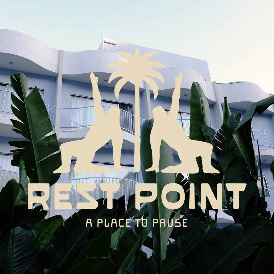
The system was designed to be flexible across physical and digital applications, with particular attention to how the brand lives within the guest experience. Subtle texture and tactile details were introduced to make the brand feel welcoming, grounded, and place-specific.
-
The result is a cohesive, adaptable brand system that successfully repositions the roadside motel as a design-led destination rather than a functional stopover.
Rest Point feels warm, confident, and memorable, with a strong visual identity that carries consistently across signage, interiors, and guest touchpoints - demonstrating how thoughtful branding can elevate hospitality experiences at every scale.